Lisa Canales-Smith wanted a revised logo for her charity, to celebrate its 25 years of operation. This led to the design of collateral such as tri-fold brochures, flyers, and online branding visuals. Then followed a website and an event registration site

| Album | ANGELS Outreach |
| Category | Archives |
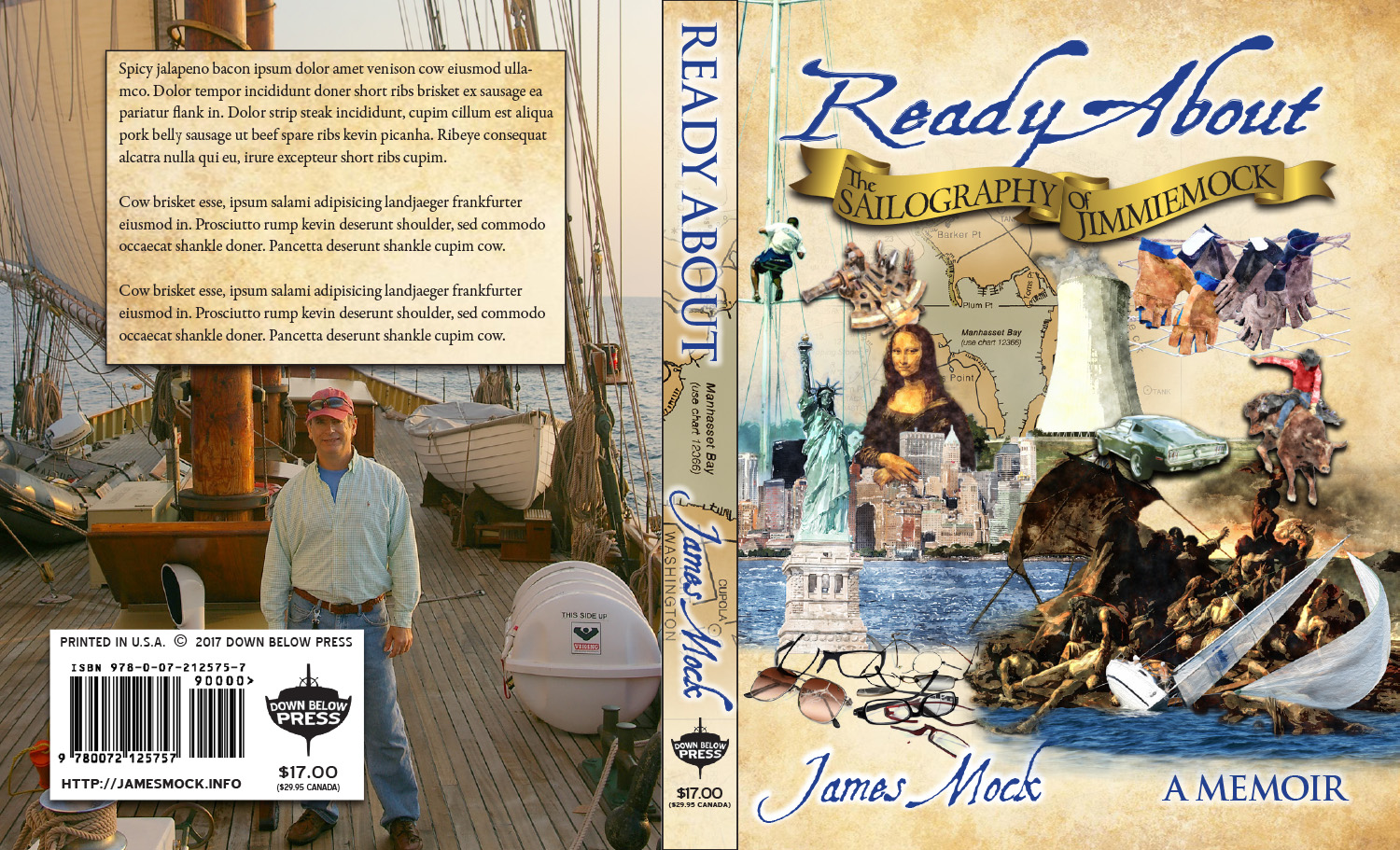
The cover of the book features icons that represent elements of the author's story from places he has visited to events he has participated in.
The revised name and logo of the author's publishing company.
The original name and logo of the author's publishing company that will handle the author's works. At the time, this was the logo chosen.
Book Pen Anchor Benguiat logo variant. The original name and logo of the author's publishing company that will handle the author's works.
Book Pen Anchor Ring Liberty logo variant. The original name and logo of the author's publishing company that will handle the author's works.
Book Pen Wheel Mercury logo variant. The original name and logo of the author's publishing company that will handle the author's works.

Masthead collage (top), and one of the slider images I assembled in Photoshop.
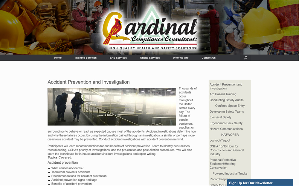
One of the illustrations I prepared in use.

An unused collage option for the site's masthead, utilizing the company's logo as hazard stripes. Assembled in Photoshop.

An unused collage option for the site's masthead. Assembled in Photoshop.

The collage chosen for the site's masthead. Assembled in Photoshop.

Article illustration assembled in Photoshop.

Collage assembled in Photoshop.

While working on the client's brand, I noticed the similarity to the logo of the fictional corporation of the Alien movie franchise, and a tagline opportunity which I just couldn't pass up.
| Album | Welder Service Company, Inc. |
| Category | Recent |
| Album | Welder Service Company, Inc. |
| Category | Recent |

| Album | Welder Service Company, Inc. |
| Category | Recent |

| Album | Welder Service Company, Inc. |
| Category | Recent |

| Album | Welder Service Company, Inc. |
| Category | Recent |

| Album | Welder Service Company, Inc. |
| Category | Recent |

| Album | Welder Service Company, Inc. |
| Category | Recent |
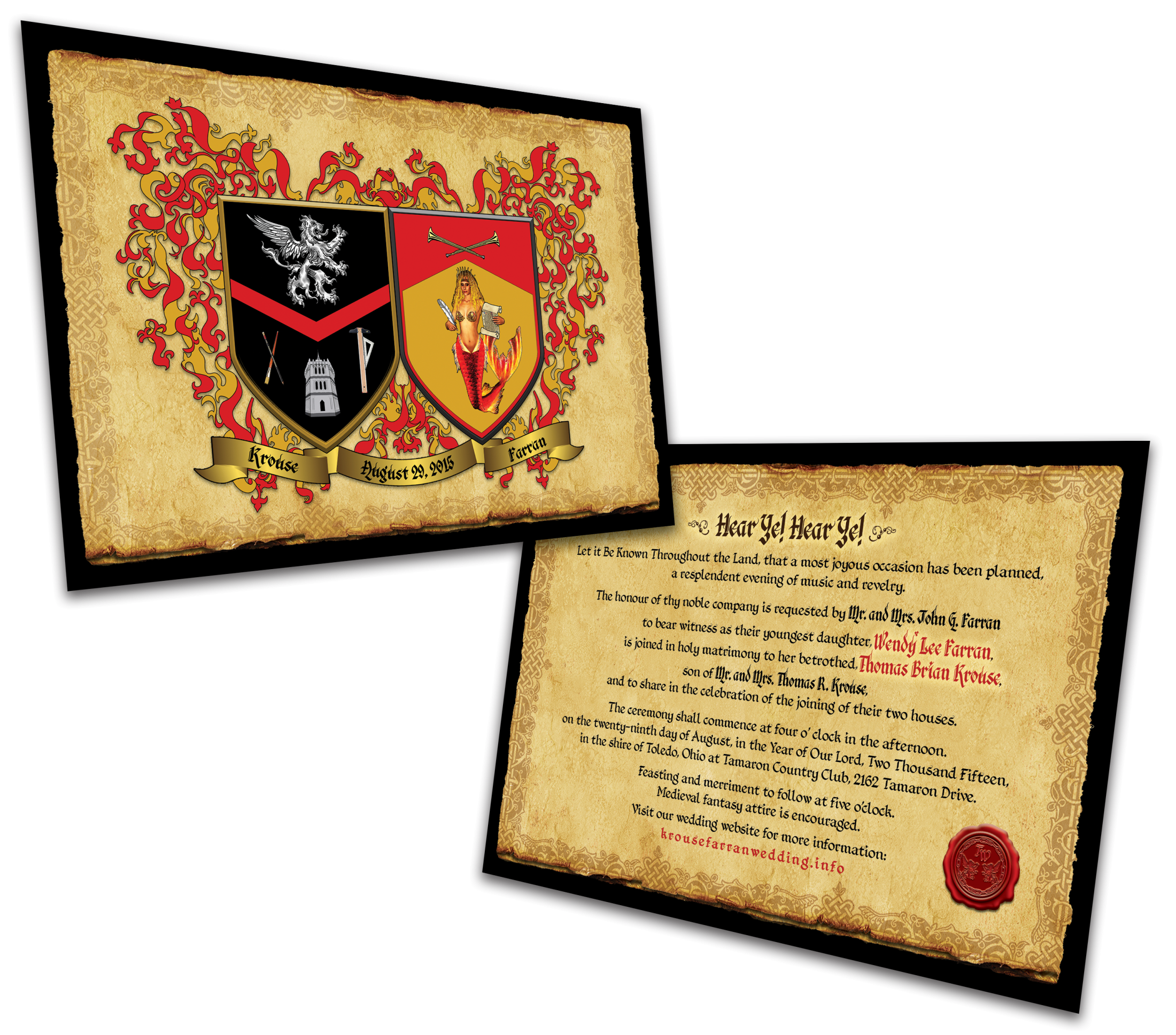
Produced via an online service, these 2-sided full-color invitations were printed on a heavy card stock with a fabric texture in keeping with the medieval theme.
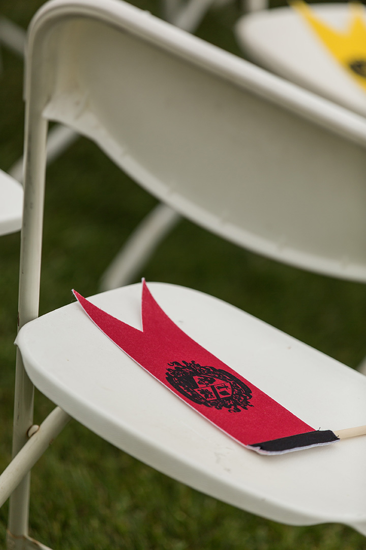
1 color, 1 sided printing. Red and yellow pennants for the guests to wave at the conclusion of the ceremony.
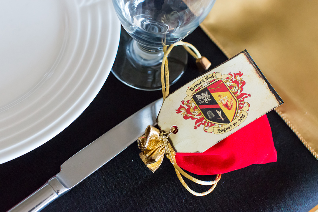
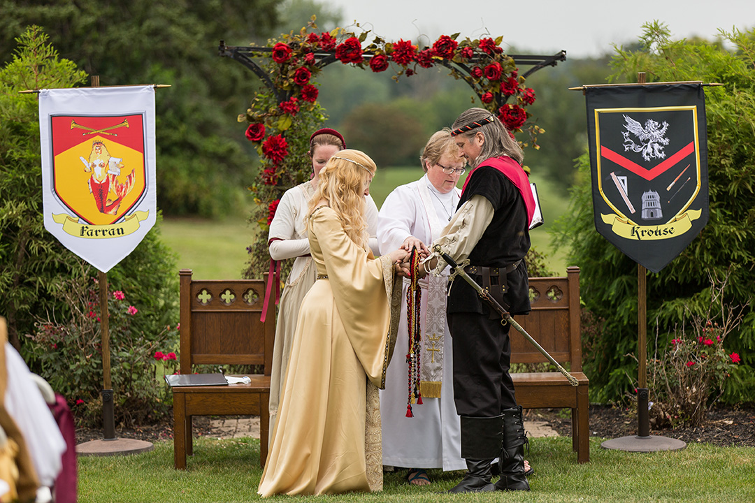
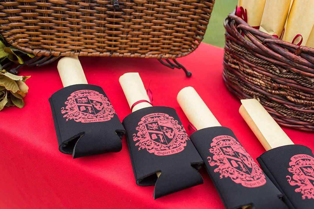
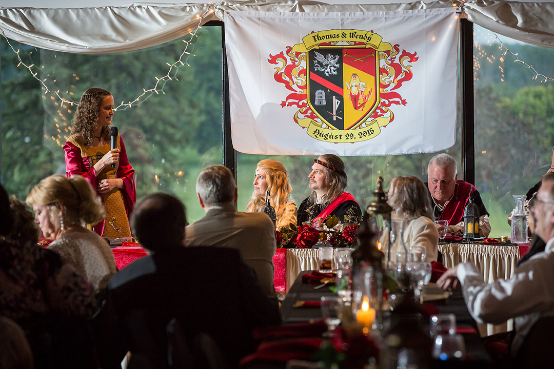
Produced at home from commercially-available precut stock, these tags bear the couple's combined arms over a parchment background rendered in Photoshop. The edges of the stock were "charred" with a permanent marker.
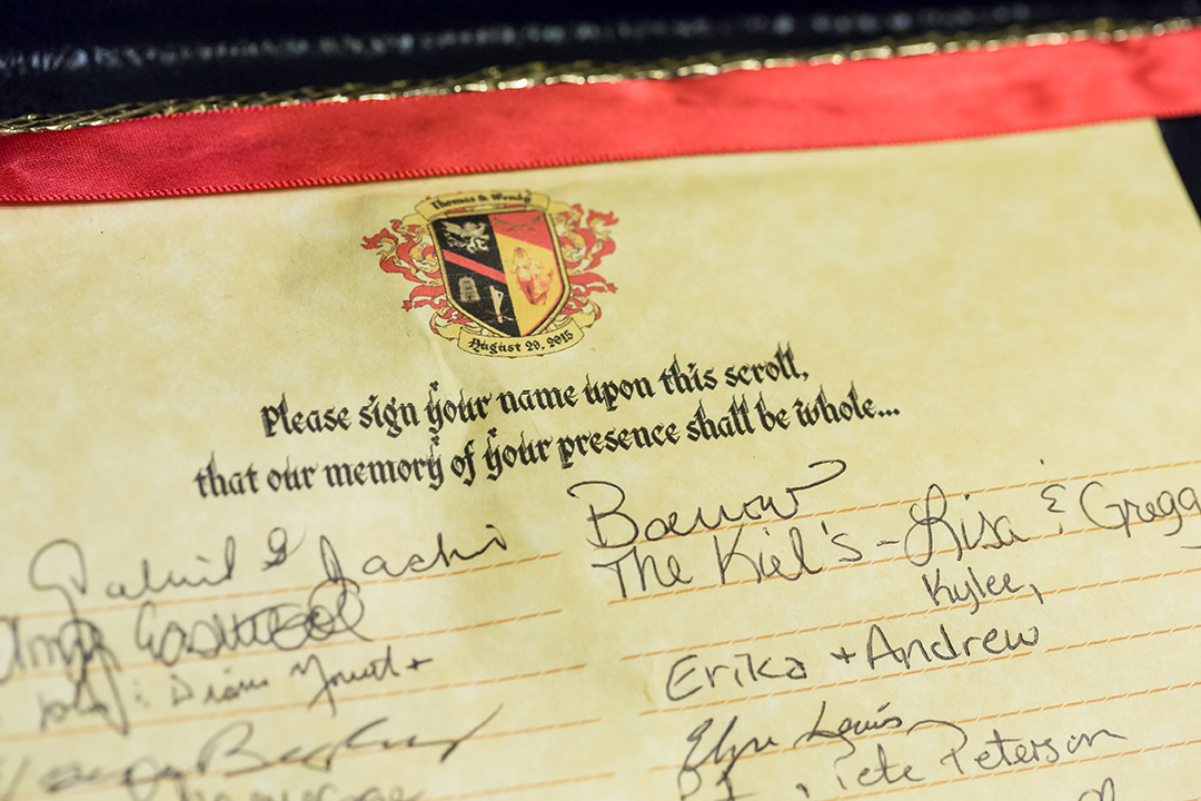
Everything had a medieval style, right down to the guest register. Produced in InDesign and printed on parchment paper stock.
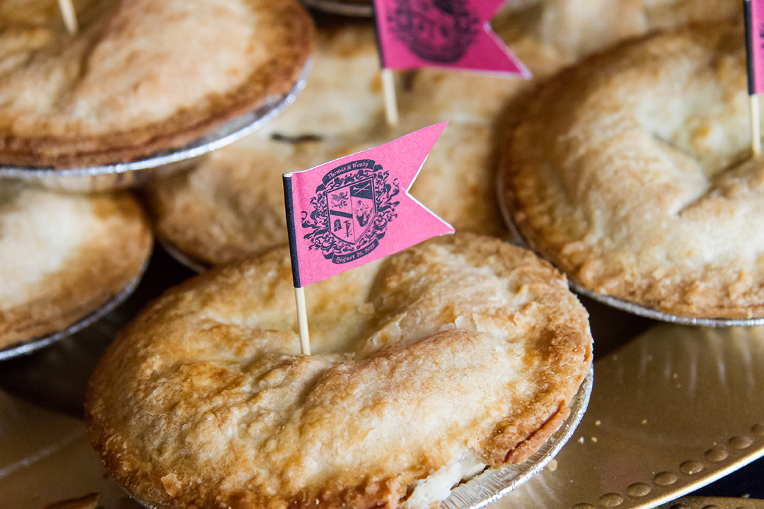
In keeping with medieval traditions, individual tarts were served for dessert, and identified by these toothpick pennants, apple tarts marked with yellow flags, and cherry tarts with red flags.
